| Question Everything!Everything!! |

Welcome to Truth, FREEDOM OR ANARCHY,Campaign of Conscience. , is an alternative media and news site that is dedicated to the truth, true journalism and the truth movement. The articles, ideas, quotes, books and movies are here to let everyone know the truth about our universe. The truth will set us free, it will enlighten, inspire, awaken and unite us. Armed with the truth united we stand, for peace, freedom, health and happiness for all
Question Everything!

MEN OF PEACE

"I don't know how to save the world. I don't have the answers or The Answer. I hold no secret knowledge as to how to fix the mistakes of generations past and present. I only know that without compassion and respect for all Earth's inhabitants, none of us will survive - nor will we deserve to." Leonard Peltier
Thursday, May 19, 2016
What Percentage of Tax Dollars Goes to Those on Welfare?
What Percentage of Tax Dollars Goes to Those on Welfare?
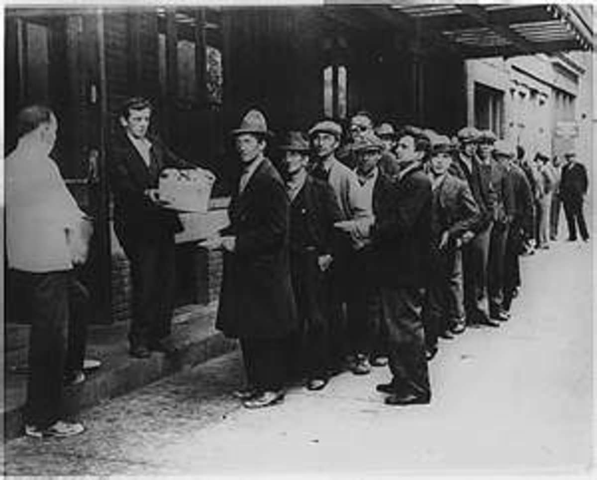
A Scene of Poverty
I HAVE BEEN MEANING TO WRITE this blog for awhile but kept forgetting. I hate old age. Recently a report on CNN's Cafferty's File brought the subject to mind again. An e-mail sent in based on one of Cafferty's questions regarding raising taxes on the wealthy got a response that went something like this:
"Why should the money the wealthy worked hard for be transferred to the poor, who hardly work at all."
Actually, it wasn't that cut-and-dried but that was the implication. Notice there was nothing in the response about helping fellow American's brought low because of the unethical conduct of many of those same wealthy tax payers. But I digress; that is fodder for a different hub.
I hope you understand, and just to be clear, the title to this Hub is a bit of sarcasm directed at those who don't believe in the Christian maxim of being your brother's keeper. Back on track, I took a look at the 2012 Federal Budget to calculate what percentage of your taxes go toward which parts of the budget. The table below presents my findings, which show how many cents of your tax dollar go to what expenditure area.
They, the Conservatives, would also, again falsely, have you believe that almost all of our non-defense dollars go to these freeloading welfare recipients. Of course, right-thinking Americans know that not to be true, but right-thinking Americans aren't spending the advertising bucks to prove it, are we?
One of the most organized, wealthy, and secretive money-men behind the conservative (libertarian) narrative are Charles and David Koch and their criminal (?) enterprise, Koch Industries. And, yes, I do mean "criminal", at least according to Jane Mayer in her 2015 book, Dark Money. As I write this in February 2016, I am about 1/3 of the way through Dark Money and just finished the chapter that details the documented facts as well as very strong circumstantial evidence that led to a multitude of successful civil trials and occasional attempts at criminal trials (so far unsuccessful due to the political machinations and outright bribery by Koch industries.
I highly recommend buying (and reading) Dark Money as it is a factual (sources coming out the wazoo) indictment of the success huge money in politics is having on not only the political polarization in America, but the negative (and wrong) stereotype that has become the dominant picture of the working poor, the poor, and the destitute in this country. It is an unpleasant eye-opener about the dark side of money in politics.
REVENUE SOURCE OR EXPENDITURE AREA
|
DISTRIBUTION OF "YOUR" TAX $$
| ||
|---|---|---|---|
2010 ACTUALS
|
2012 ACTUALS
|
2014 ACTUALS
| |
Total Receipts
|
$ 2,162.6 B
|
$ 2,450 B
|
$ 3,021.6 B
|
LESS: Social Security, Medicare, & Unemployment
|
$ 864.8 B
|
$ 845.3 B
|
$ 1,023.5 B
|
Available Receipts For non-Trust Fund Expenses
|
$ 1,297.9 B
|
$ 1,604.7 B
|
$ 1,998.5 B
|
Personal Income & Payroll Tax $B
|
$ 898.5 B
|
$ 1,132.2 B
|
$ 1,394.6 B
|
Other Receipts
|
$ 399.3 B
|
$ 472.5 B
|
$ 603.5 B
|
Deficit Contribution
|
$ 1,294.8 B
|
$ 1,086.9 B
|
$ 484.4 B
|
Personal Income Contribution to $1 of Outlays
|
$ 0.35 (i00%)
|
$ 0.42 (100%)
|
$ 0.56 (100%)
|
Net Interest on the Debt
|
$ 0.03 (8.6%)
|
$ 0.03 (7.1%)
|
$ 0.05 (8.9%)
|
Defense
|
$ 0.09 (25.7%)
|
$ 0.10 (23.8%)
|
$ 0.13 (23.2%)
|
Non-Defense
|
$ 0.08 (22.9%)
|
$ 0.09 (21.4%)
|
$ 0.13 (23.2%)
|
Unfunded Social Security & Medicare
|
$ 0.06 (17.1%)
|
$ 0.07 (16.7%)
|
$ 0 08 (14.3%)
|
Means-tested Assistance
|
$ 0.04 (11.4%)
|
$ 0.04 (9.5%)
|
$ 0.07 (12.5%)
|
Medicaid
|
$ 0.03 (8.6%)
|
$ 0.04 (9.5%)
|
$ 0 07 (12.5%)
|
Other Programmatic Mandatory Programs
|
$ 0 .02 (5.7%)
|
$ 0.04 (9.5%)
|
$ 0.04 (7.1%)
|
TABLE 1 SOURCE: http://www.gpo.gov/fdsys/pkg/BUDGET-2016-TAB/pdf/BUDGET-2016-TAB.pdf, Tables 1.1, 2.1, 2.4, 8.1, 8.5 and 8.7 - All Dollars Are Nominal
You Should Be Able to See the Obvious ...
... but I have some remarks anyway.
First let me tell you what changed. The results you see are from a much better data source than what I first used, see citation under the table. I added the relevant portions of income receipts, focusing, of course, on personal taxes. I also emphasized Social Security because I adjusted the effect of "paid-for" programs of Social Security and Medicare, as well as unemployment payments.
I did this because none of your personal income tax dollars goes to pay for those programs. But, because Social Security and Medicare payroll taxes don't cover the entire bill, the unfunded portion is paid for via the general fund and the deficit.
Further, I reorganized everything in an attempt to make it more understandable as well as bring out some interesting facts the previous version did not. In any event, while some numbers changed from earlier, it is at the margins, so the story I am telling hasn't changed.
Myth-Busting
There are two persistent myths Americans have been bombarded with, almost daily, since April 2009:
- There has been little or no recovery since 2009. (in fact some say we are still in a recession); yes, that's right, the Right started complaining that President Obama has failed to improve the economy as they expected after the first stimulus dollars were spent.
- Public assistance (welfare) eats up most of the non-defense budget. If you believe the Right, the biggest threat to hard-working Americans (the 53%, I presume) are lazy, able-bodied men and women who choose not to work. Neither claim is correct even though a majority of Americans think it is. It is very easy to throw stones, but very hard to show those stones are actually blatant lies. That is why propaganda and negative advertising (Left or Right) is so effective. It is even more true because so many Americans have stopped thinking for themselves and just parrot what their favorite talking head says.
What Caused the Large Increase in Tax Receipts

CHART 1 - SOURCE: GDP Grows Steadily at about 2.1%/year; - federal receipts also grows, but at a higher 6.9%/year. Fulling this is a decline in unemployment. | Source
The Current Recover Has Been Faster Than Previous Ones
To the claim President Obama has done a horrible job regarding the economy and in spite of, lest we forget, the Conservatives promise to do everything in their power to defeat PBOs programs, the data clearly show that the claim is pure bunk.
In nominal terms, total tax receipts have grown 30% or about 6.7% per year in terms of real dollars from an economy that grew at roughly 2.1% per year. It's not a stellar recovery, but it happened sooner that in previous great recessions and depressions and it was consistent. Had the Conservatives not spent their every waking trying to fulfill the promise they made to themselves the day of President Obama was inaugurated, the economy might have grown at a healthier 3%, but, unfortunately, we will never know..
Increasing tax receipts are the primary reason the deficit has plummeted to $484 billion in current dollars, not reduced spending, although that certainly has helped as well. And the increase in tax receipts came mainly from an improved economy with 9.8 million more people back at work since 2009.
One could try to argue that the main source of increased tax receipts is increased taxes resulting from Obamacare, beginning in 2011, and the 2013 FIscal Cliff compromise; but that is not the case. The current propaganda campaign against the new taxes (nothing is said of the tax credits and lower Medicare costs that were part of the deal, of course) created with the implementation of ACA.
If I take those new excise taxes into account and replot Chart 1, the result will be an imperceptible change in tax receipts. Table 13.1 from my source will show you that since 2011, new receipts have amounted to only $3 billion a year, a drop in the tax receipts bucket.
What impact did the fiscal cliff compromise have? According to the CBO, when the dust settled on all of the tax increases and decreases and spending increases, the deficit would decrease by about $157 billion. That translates to roughly 50% of the increase in tax revenue between 2013 and 2014; the rest was due to growth in the economy, virtually all of the increase between 2010 and 2013 was from increased economic activity.
As to how long America took to recover from the Great Recession of 2008: it was faster than you think. Some research I am doing that looks at the kind of financially based recessions vs other types of recession. One of the preliminary results is that the average length of recovery time (as measured by returning to the real GDP that was experienced just prior to the recession) of 5.4 years; the Great Recession of 2008 lasted 4 years. Further, the recovery time for non-financially-based recession is just 2.3 year; strongly suggesting that it typically takes much longer to recover from a recession similar to what we had in 2008. So, did President Obama do better than average in bringing the economy back to where it was before the downturn? It would appear he did.
In current dollars, the deficit shrank $810 billion between 2010 and 2014. Tax receipts, on the other hand, increased $859 billion. Discretionary spending (what the Capitol Hill battles are all about and one of the pillars on which conservatives stand in balancing the budget, decreased only $169 billion.
How Much Of The Federal Budget Is Spent on Welfare?
Public assistance programs, those most commonly thought of as welfare like SNAP and TANF, do not consume an inordinate amount of the Federal Budget, whether on or off books.
To help explain why, I offer Table 2 which takes a slightly different view on the information contained in Table 1 by comparing data with each other.
Analyzing Table 1
Annual Growth (Decline)
|
Change in % of Your Tax $ Used, 2010 - 2014
| |
|---|---|---|
DISCRETIONARY - Defense
|
-3.54 %
|
-2.5 % Points
|
DISCRETIONARY - non-Defense
|
- 3.02 %
|
0.1 % Points
|
MANDATORY - Social Security (Unfunded Portion)
|
4.79 %
|
- 2.8 % Points (Combined SS, Medicare, % UE))
|
MANDATORY - Medicare (Unfunded Portion)
|
3.14 %
| |
MANDATORY - Unemployment (Unfunded Portion)
|
- 27.83 %
| |
MANDATORY - Medicaid
|
2.53 %
|
3.9 % Points
|
MANDATORY - "Welfare"
|
0.89 %
|
1.1 % Points
|
Net Interest on Debt
|
3.9%
|
0.3 % Points
|
TABLE 2 - AS A BASELINE, INFLATION HAS AVERAGED ABOUT 2% per YEAR (which means subtract 2% from each annual growth figure to get an approximation of "Real" growth)
So, Where's the Beef?
Where is the gargantuan growth in welfare programs the propagandists are telling you, over and over again, is there? It should be clear to you the message the Right is blasting the airwaves with is a hoax, a sham, a "sky-is-falling" bit of histrionics,
The Myth is that most of your hard earned tax dollars are going to support those who refuse to work because welfare pays so much they can live "high-on-the-hog". Well, Tables 1 and 2 shows you that message is hogwash. Let's look*.
1. From Table 1, we see that the Discretionary programs account for around 46% of each income tax dollar spent.
-- A. Table 2 shows they have been declining a little over 3% a year (or 5% after inflation).
-- B. Defense spending has declined as a percent of your tax dollar while non-defense has remained constant.
2.While the unfunded portions of Social Security and Medicare have increased somewhat, about 1.5% per year after inflation, unemployment has fallen dramatically (as you would expect with an improving economy).
3. Medicaid likewise has grown at only around 1% in real dollars.
-- A. Nevertheless, it is taking a larger, but not unreasonable, chunk out of your tax dollar.
-- B. Costs should continue to increase as the expanded Medicaid programs kick in.
4. Growth in net Interest of the debt has also been very modest and will continue to be so, so long as inflation and interest rates are kept in check.
5. Contrary to popular belief, public assistance has decreased in real terms by around 1%! But because other programs have fallen further, the percent spent out of your tax dollar increased 1.1 percentage points, from 11.4% to 12.5%
So, is the propaganda about welfare spending true or false? I know what my answer is.
* "Unfunded Portion" means the amount remaining the general fund must pick up after the other sources of funding, i.e., payroll and unemployment taxes, have been exhausted.
New Information
How do recipients of public assistants spend what they get. Digging into this information will dispel even more myths regarding "welfare queens," and the idea that public assistance is a disincentive to work, etc. The table below shows you how people spend public assistance and compare those habits to those families who do not receive assistance.
The information is taken from Bureau of Labor Statistics, Behind the Numbers. Their source is the 2011 Consumer Expenditure Survey (CES).
Average annual expenditures, families with children under 18, by receipt of means-tested government assistance, 2011
Expenditure Category
|
Families w/ children receiving assistance
|
Families w/ children NOT receiving assistance
|
% Difference
|
|---|---|---|---|
Total Average Disposable Income
|
$30,852 (Cents Out of $1 Spent)
|
$66,525 (Cents Out of $1 Spent)
|
- 115.6%
|
Food at Home
|
17.3
|
9.7
|
43.9%
|
Dining Out
|
3.8
|
4.6
|
- 21.1%
|
Housing
|
38.7
|
34.3
|
11.4%
|
Apparel and Services
|
3.7
|
2.4
|
35.1%
|
Transportation
|
17.2
|
16.9
|
1.7%
|
Healthcare
|
2.9
|
5.5
|
-89.7%
|
Entertainment
|
4.4
|
5.1
|
- 15.9%
|
Personal Insurance and Pensions
|
6.2
|
13.7
|
-121%
|
Other
|
5.8
|
7.6
|
- 31.0%
|
TABLE 2 - Figures Represents How Many cents out of each disposable dollar is spent in that category.
Take-aways From Table 2
First, let me point out that according to my unofficial survey, 49 hubbers think that the minimum amount of money a family of three living in a typical Mid-West neighborhood needs to barely make it is between $32,000 and $38,000 (seePoverty - What Does It Take To Survive).
Then, consider that the average income for those with children who receive public assistance is only $30,582 per year. This is between $1,500 and $7,500 less than what is needed to barely survive. Then compare that with the $66,525 average income earned by those same types of families who do not draw assistance; this is more than double what the less fortunate have.
Since the average assistance each family who gets it is just shy of $7,000/year, that means they worked for the other $23,000 (this is who the Right think of as the lazy, "Free-Loading, Indigent, Ought-to-Get-a-Job Americans"). News flash, they have a job, just not one which pays enough to live on.
Sidebar: The most common refrain I hear from those who oppose helping fellow Americans is that the answer is simple: find a better paying job. What nonsense. Let's assume for the moment that they all do. Then one of three things will happen,
- Employers will simply fill those low paying jobs with new workers who still need assistance,
- Employers will go out of business because they ran out of people to hire, or
- Employers will raise their wages. Well, so long as unemployment stays above 3 or 4%, options 2 and 3 simply won't happen. What will take place then is another cohort of lazy, "Free-Loading, Indigent, Ought-to-Get-a-Job Americans" will join the low-paying workforce for the Right to have the opportunity to denigrate.
Now, consider where each group spends their money. The poor who receive assistance spend most of their money where you would hope they would: food prepared at home (17.3 cents), housing (38.7 cents), and transportation (17.2 cents), for a total of 73.2 cents. One of the most expensive, Healthcare, goes by the wayside (this is before Obamacare).
On the other hand, those who aren't struggling to exist spend only 61.2 cents. Where did the extra 12 cents go? Primarily to Healthcare and Personal Insurance, things to improve your quality of life and protect your future, something the poor simply can't afford.
Subscribe to:
Post Comments (Atom)

No comments:
Post a Comment
Anyone is welcome to use their voice here at FREEDOM OR ANARCHY,Campaign of Conscience.THERE IS NO JUSTICE IN AMERICA FOR THOSE WITH OUT MONEY if you seek real change and the truth the first best way is to use the power of the human voice and unite the world in a common cause our own survival I believe that to meet the challenges of our times, human beings will have to develop a greater sense of universal responsibility. Each of us must learn to work not just for oneself, ones own family or ones nation, but for the benefit of all humankind. Universal responsibility is the key to human survival. It is the best foundation for world peace,“Never be afraid to raise your voice for honesty and truth and compassion against injustice and lying and greed. If people all over the world...would do this, it would change the earth.” Love and Peace to you all stand free and your ground feed another if you can let us the free call it LAWFUL REBELLION standing for what is right